I used to think some people were just naturally good at coloring. Turns out, they just knew these tricks.
You know that feeling when you see someone’s coloring page and think, “How did they make it look so… professional?” Meanwhile, your own pages look like, well, like you colored them with crayons from a restaurant kids’ menu.
I’ve been there. We’ve all been there.
The good news? Those people aren’t magical unicorns blessed with artistic superpowers. They just know a few tricks that nobody bothers to teach beginners. Today, I’m sharing those tricks with you.
Let’s Be Real About Why Your Coloring Looks… Not Great
Before we dive into the good stuff, let’s talk about why most of us struggle with coloring. It’s not because we’re bad at it – it’s because nobody ever taught us properly.
Think about it. When you were a kid, someone handed you a box of crayons and said “stay inside the lines.” That was it. No technique, no tips, no nothing.
So we grew up thinking coloring was just about filling in spaces with whatever color felt right. And when our adult coloring pages looked flat and weird, we figured we just weren’t artistic.
Plot twist: It’s not about being artistic. It’s about knowing what you’re doing.
Technique #1: Stop Trying to Color Everything in One Go
This one changed everything for me. I used to press down hard and try to get my final color in one pass. The result? Waxy, streaky, amateur-looking mess.
Here’s what actually works:
Start light. Like, barely-touching-the-paper light. Think of it like building a tan – you don’t go from pale to bronze in one day. You build it up slowly.
Here’s my process:
- First pass: So light you can barely see it
- Second pass: Still light, but you can see color now
- Keep adding layers until you get the richness you want
- Use tiny circular motions between layers
I know it takes longer, but trust me on this one. The difference is night and day. Your colors will be smooth, even, and look like you actually know what you’re doing.
Pro tip I learned the hard way: You can always make something darker, but you can’t make it lighter. Start light, always.
Technique #2: Use Color Psychology (It’s Not as Fancy as It Sounds)
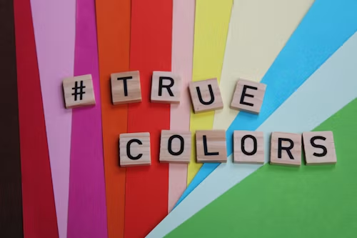
This sounds complicated, but it’s actually super simple once you get it. Some colors make things look closer, others make them look farther away.
Warm colors (reds, oranges, yellows) jump out at you. They’re like that friend who talks loud – impossible to ignore.
Cool colors (blues, greens, purples) step back. They’re the quiet friend who’s equally important but doesn’t demand attention.
Here’s how I use this: If I want something to be the star of my coloring page, I use warm colors. If I want it to fade into the background, cool colors.
Example time: I’m coloring a garden scene. The flowers I want to pop? Warm pinks and yellows. The leaves and background stuff? Cool greens and blues. Maybe I’ll add a tiny touch of purple in the shadows because it looks fancy.
It’s like having a volume knob for different parts of your picture.
Technique #3: The Magic Smooth Trick (Burnishing)
Okay, this one is going to blow your mind. You know how some colored pencil work looks almost like paint – all smooth and professional? There’s a secret technique for that.
It’s called burnishing, and it’s basically controlled melting of your colored pencil.
What you need:
- Your regular colored pencils
- A white colored pencil or colorless blender (trust me, get one)
- Decent paper (not the thin stuff that came with your coloring book)
How to do it:
- Color your area normally using the layering technique above
- Take your white pencil or blender
- Press down firm (harder than you normally would) and work in small circles
- Watch the magic happen as your color becomes buttery smooth
Fair warning: This eats up your pencils faster, so save it for special areas or when you really want to show off.
Technique #4: Figure Out Where the Light’s Coming From
This one made me feel like an idiot when I finally learned it. I spent years coloring things with no thought about light, and then wondered why everything looked flat.
Professional artists always know where their light is coming from. Always.
Here’s my simple system:
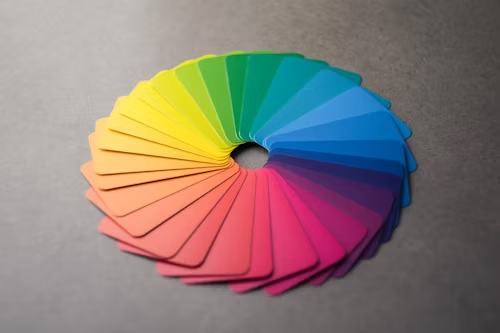
- Before I start coloring, I pick where my light source is (usually top-left)
- I imagine which parts would be brightest (closest to the light)
- I figure out which parts would be in shadow
Then I color accordingly. Brightest areas get light colors or sometimes I leave them white. Shadow areas get darker versions of my main color.
Game-changer tip: Don’t just use black for shadows. Use purple or dark blue instead. It looks way more professional and realistic.
Once I started doing this, people began asking me where I learned to color. The secret? I just started paying attention to light.
Technique #5: Stop Picking Random Colors
I used to pick colors based on what I felt like using that day. Blue elephant? Sure, why not! Purple grass? Sounds fun!
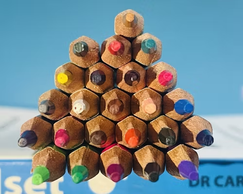
And you know what? Sometimes that works for a fun, whimsical look. But if you want your coloring to look professional and cohesive, you need to think about color harmony.
Here are my go-to color schemes:
When I want something elegant: I use different shades of the same color family. All blues, or all greens, or all purples. It’s almost impossible to mess up.
When I want something peaceful: I use colors that sit next to each other on the color wheel. Like blue and green, or red and orange.
When I want drama: I use opposite colors. Blue and orange, red and green, purple and yellow. These combinations pop like crazy.
My lazy person trick: When I can’t decide, I go with the peaceful option (next-door colors). It always looks put-together.
Technique #6: Make Things Look Real with Texture
This is where you can really show off. Different things in your coloring page should feel different, even though you’re just using colored pencils.
For hair or fur: Short, quick strokes following the direction it would naturally grow. Don’t color every strand – leave some white lines between groups of strokes.
For fabric: Smooth, long strokes for silk or satin. Cross-hatch (draw lines going different directions over each other) for rough textures.
For nature stuff: Circular motions for clouds, up-and-down strokes for tree bark, side-to-side for water.
I used to color everything the same way – just solid color filling. Now I think about what I’m coloring and try to make my pencil strokes match what that thing would actually feel like.
Technique #7: The Finishing Touch That Makes Everything Look Professional
Here’s what separates the pros from everyone else: they don’t just stop when they’ve filled in all the spaces. They go back and make everything better.
My finishing checklist:
- Step back and look at the whole thing. What needs more contrast?
- Add the darkest darks and lightest lights
- Clean up any messy edges
- Add tiny details that make everything pop
The secret sauce: At the very end, I always add the deepest shadows and brightest highlights. This makes all the middle colors look more vibrant, even though I didn’t change them.
It’s like turning up the contrast on your TV – suddenly everything looks more professional.
Let’s Talk About Supplies (But Not Get Crazy About It)
Look, you don’t need to spend a fortune on supplies. I started with basic Crayola colored pencils and they worked fine for learning these techniques.
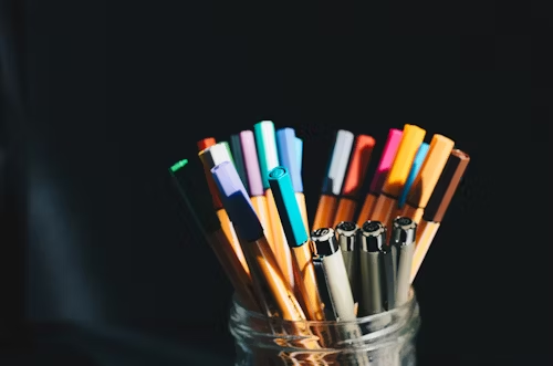
If you’re just starting: Crayola colored pencils are honestly pretty good. Don’t let anyone shame you about this.
If you want to upgrade: Prismacolor Premier pencils blend beautifully and aren’t too expensive. You can find them at most craft stores. If you’re ready to upgrade your supplies, I highly recommend trying the Prismacolor Premier colored pencils — they blend beautifully and are perfect for practicing layering and burnishing.
If you get obsessed: Faber-Castell Polychromos are the fancy ones. They’re amazing, but only buy them if you’re sure you’re going to stick with this hobby.
Paper matters too: Get something thicker than regular printer paper. Bristol board works great, or look for “mixed media” paper at the art store.
The Mistakes That Scream “Beginner” (So You Can Avoid Them)
Let me save you some embarrassment by sharing the mistakes I made for way too long:
Using the same pressure everywhere: Real things aren’t all the same intensity. Vary your pressure to make things look natural.
Filling in everything: Leave some white spaces! They make your colors look brighter and more alive.
Making everything equally important: Pick a focal point and make it pop while letting other areas be supporting players.
Rushing: I know it’s tempting to speed through, but good coloring takes time. Put on a podcast and slow down.
Practice Ideas That Actually Help
Week 1: Pick a simple picture and focus only on the layering technique. Don’t worry about anything else.
Week 2: Color the same picture again, but this time think about warm vs. cool colors.
Week 3: Practice with simple shapes (circles, squares) and focus on where the light hits them.
Week 4: Try different textures on different parts of a picture.
You can try our coloring pages collection:
When Things Go Wrong (Because They Will)
Colors look muddy: You probably layered too many different colors. Next time, use fewer colors or stick to colors that are closer together on the color wheel.
Can’t get smooth coverage: Either use lighter pressure and more layers, or upgrade your paper.
Doesn’t look like what you wanted: Make a test swatch on scrap paper before committing to the real thing.
Running out of your favorite color: Learn to layer different colors to create new ones. Blue over yellow makes green, red over yellow makes orange.
The Real Talk Section
Here’s the thing nobody tells you about coloring: it’s supposed to be relaxing and fun. If you’re stressing about making it perfect, you’re missing the point.
These techniques will help you create better results, but don’t let them steal your joy. Some days you want to color a purple elephant just because purple elephants make you happy. Do that.
The best part about knowing these techniques is that they become second nature. You stop thinking about them and just do them automatically. Then you can get back to the zen of coloring without worrying about whether you’re doing it “right.”
Your Next Steps
Don’t try to implement all seven techniques tomorrow. Pick one – I recommend starting with the layering technique – and practice that until it feels natural. Then add the next one.
Remember, everyone who’s good at something was once terrible at it. The only difference between you and those people whose coloring makes you jealous is that they’ve practiced these techniques longer.
Your coloring pages are about to get so much better that people will start asking for your secrets. And now you’ll actually have some to share.
The Bottom Line
Professional-looking coloring isn’t about talent or expensive supplies. It’s about knowing a few key techniques and taking your time to apply them.
Start with one technique. Practice it until it becomes automatic. Then add another. Before you know it, you’ll be the person whose coloring pages make other people wonder how you got so good.
And the best part? Once you know these secrets, you can’t unknow them. Every coloring page you do from now on will be better than your last.
Now stop reading and go practice. Your future amazingly-colored pages are waiting for you.
