

Color blending is the invisible thread that weaves together masterful artwork. Whether you’re watching a sunset melt from golden yellow into deep crimson, or observing how shadows dance across a portrait, seamless color transitions create the magic that transforms flat surfaces into living, breathing art.
Yet for many artists, color blending remains one of the most challenging skills to master. Too often, promising artwork falls flat due to harsh transitions, muddy mixtures, or colors that simply don’t harmonize. The difference between amateur and professional work often lies not in drawing ability, but in the subtle art of making colors flow together naturally.
This comprehensive guide will transform your approach to color blending, taking you from basic color theory to advanced professional techniques. You’ll learn not just the “how” but the “why” behind effective color mixing, giving you the confidence to tackle any blending challenge with precision and artistry.
The Foundation – Understanding Color Theory
Before diving into techniques, you must understand the language of color. Color theory isn’t just academic knowledge—it’s the roadmap that guides every blending decision you make.
The Color Wheel: Your Blending Compass
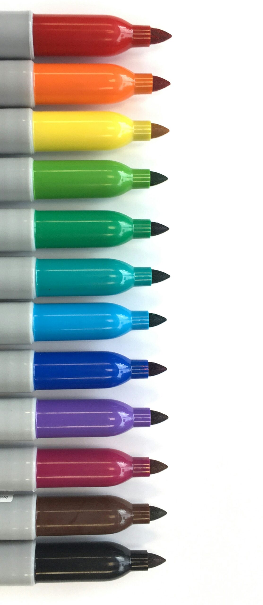
The traditional color wheel consists of three primary colors (red, blue, yellow), three secondary colors (orange, green, purple), and six tertiary colors created by mixing primaries with secondaries. But here’s what most artists miss: the relationships between these colors determine how successfully they’ll blend.
Adjacent colors (analogous colors) blend naturally because they share common pigments. Blue blends beautifully with blue-green because they’re neighbors on the color wheel. This creates harmonious, peaceful transitions.
Opposite colors (complementary colors) create vibrant contrast but can turn muddy when mixed directly. Red and green, when blended, create neutral grays and browns. Understanding this prevents the frustration of accidentally creating mud when you wanted vibrancy.
Color Temperature: The Secret to Natural Blending

Every color has a temperature—it leans either warm (toward red/yellow) or cool (toward blue). Professional artists use temperature shifts to create depth and natural-looking transitions.
When blending, consider that:
- Warm colors advance (come forward)
- Cool colors recede (go backward)
- Gradual temperature shifts create natural depth
- Abrupt temperature changes create dramatic focal points
For example, when painting a sunset sky, you might transition from warm orange at the horizon to cool purple at the zenith. This temperature progression creates natural atmospheric depth.
The Myth of “Just Mix Any Colors”
Beginning artists often believe they can mix any two colors successfully. This leads to muddy, lifeless results. Professional blending follows clear principles:
- Limit your palette: Use fewer, higher-quality colors rather than many mediocre ones
- Understand color bias: Every “primary” color leans toward one of its neighbors
- Know your mediums: Different paints behave differently when mixed
- Plan your transitions: Map out color changes before you begin blending
Essential Tools for Professional Blending
Your tools can make or break your blending success. Professional results require professional preparation.
Brushes: Your Blending Arsenal
Flat brushes (sizes 6-12) excel at creating smooth, even transitions. Their chisel edge allows for both broad strokes and fine linear work.
Round brushes (sizes 4-10) offer versatility for both detailed work and broad blending. Their pointed tip enables precise color placement while their belly holds enough paint for smooth transitions.
Fan brushes create soft, feathered effects perfect for atmospheric blending, hair texture, and cloud formations.
Blending brushes or “mops” are soft, fluffy brushes designed specifically for smoothing color transitions without adding new pigment.
Palette knives aren’t just for mixing—they’re excellent for creating smooth color gradients and impasto blending effects.
Mediums and Additives: Extending Your Possibilities
Slow-drying mediums extend working time, crucial for complex blends. They prevent paint from becoming tacky before you achieve smooth transitions.
Glazing mediums allow transparent color layers, enabling luminous blending effects impossible with opaque paint alone.
Flow improvers help paint spread more smoothly, reducing brush marks in your blends.
Retarders (for acrylics) slow drying time, giving you more opportunity to perfect transitions.
Surface Considerations
Canvas texture affects blending ease. Smooth surfaces allow for seamless transitions, while textured surfaces create interesting broken-color effects.
Paper weight and absorbency dramatically impact watercolor blending. Heavier papers allow more working time and smoother transitions.
Priming and preparation create the ideal foundation for your blending work. Poor surface preparation leads to uneven paint absorption and patchy blends.
Fundamental Blending Techniques
Master these core techniques, and you’ll have the foundation for any blending challenge.
Wet-on-Wet Blending: The Foundation Technique
This technique involves applying wet paint into or alongside other wet paint, allowing colors to flow together naturally.
Step-by-step process:
- Apply your first color with confident, overlapping strokes
- While the paint remains wet, load your brush with the second color
- Work the second color into the edge of the first, using gentle back-and-forth motions
- Use a clean, damp brush to soften the transition zone
- Work quickly—you have limited time before the paint begins to set
Pro tip: Keep your brush properly loaded but not overloaded. Too much paint creates uncontrollable bleeding; too little creates drag and streaking.
Wet-on-Dry Blending: Precision and Control
This technique involves applying wet paint over completely dry paint, offering more control but requiring different skills.
Glazing approach:
- Allow your base layer to dry completely
- Mix your second color with glazing medium for transparency
- Apply in thin, even layers
- Build color gradually through multiple glazes
- Each layer adds depth and richness to your blend
Scumbling approach:
- Load your brush with opaque paint
- Lightly drag across the dry surface
- Allow the underlying color to show through
- Build texture and color variation gradually
Creating Smooth Gradients
Professional gradients require patience and technique:
- Plan your transition: Identify your start and end colors
- Mix intermediate steps: Create 3-5 color mixtures between your endpoints
- Work in sections: Blend small areas before moving to the next
- Overlap while wet: Each new section should overlap the previous while still workable
- Final smoothing: Use a clean brush to eliminate any remaining boundaries
The “Lost and Found” Edge Technique
Professional artists rarely create perfectly smooth blends throughout an entire painting. Instead, they vary edge quality:
- Hard edges create focus and drama
- Soft edges suggest atmosphere and depth
- Lost edges allow viewer imagination to complete forms
- Found edges bring areas back into sharp focus
Medium-Specific Blending Mastery
Each medium has unique characteristics that affect blending approach and results.
Oil Painting: The Blending King
Oils offer the longest working time and most forgiving blending properties.
Advantages:
- Extended working time allows for complex blends
- Paint can be manipulated for hours or even days
- Colors remain vibrant when mixed
- Easy to correct mistakes
Key techniques:
- Alla prima blending: Complete blending while all colors remain wet
- Palette knife blending: Creates smooth, impasto effects
- Brush blending: Traditional approach using various brush techniques
- Finger blending: Surprisingly effective for soft atmospheric effects
Professional tips:
- Use a light touch—overworking kills luminosity
- Clean brushes frequently to prevent muddy colors
- Work fat-over-lean (more oil medium in upper layers)
- Consider paint consistency—thicker paint for texture, thinner for smooth blends
Watercolor: Embracing Spontaneity
Watercolor blending requires a different mindset—you’re partnering with the medium rather than controlling it completely.
Wet-in-wet magic:
- Pre-wet your paper with clean water
- Drop color into the wet area
- Allow colors to flow and mingle naturally
- Tilt paper to encourage desired flow patterns
- Add more color while areas remain damp
Controlled wet-in-wet:
- Pre-wet only specific areas
- Use varying water concentrations for different effects
- Work quickly while the paper remains at optimal dampness
- Use salt, alcohol, or other additives for special effects
Graduated washes:
- Mix a large puddle of your darkest color
- Start at one end with full-strength color
- Add water to your brush (not the puddle) as you progress
- Work quickly with overlapping horizontal strokes
- Finish with clean water for the lightest area
Acrylic: Speed and Versatility
Acrylics dry quickly, requiring efficient blending techniques.
Retarding techniques:
- Use acrylic retarder to extend working time
- Work in smaller sections
- Keep a spray bottle handy to maintain paint workability
- Consider using “open” acrylics designed for extended working time
Glazing approaches:
- Build color through transparent layers
- Each layer adds depth and complexity
- Allow complete drying between layers
- Use glazing medium for proper consistency
Wet blending strategies:
- Work efficiently—you have minutes, not hours
- Pre-mix transition colors on your palette
- Use larger brushes to cover area quickly
- Consider using a stay-wet palette
Colored Pencil: Patience and Precision
Colored pencil blending requires different tools and approaches.
Layering technique:
- Apply base colors lightly
- Layer additional colors gradually
- Use circular or linear strokes consistently
- Build color intensity slowly
Solvent blending:
- Use colorless blender pencils
- Try odorless mineral spirits with cotton swabs
- Experiment with rubber cement pickup for lifting color
- Burnish with light-colored pencils for smooth finishes
Paper considerations:
- Smooth papers allow for seamless blends
- Textured papers create interesting broken-color effects
- Paper color affects final appearance
- Fixative helps prevent wax bloom
Digital Painting: Infinite Possibilities
Digital tools offer unique blending opportunities unavailable in traditional media.
Brush settings mastery:
- Adjust opacity for transparent layering effects
- Modify flow settings for realistic paint behavior
- Experiment with texture brushes for varied effects
- Use pressure sensitivity for natural variation
Layer blending modes:
- Multiply for rich shadows
- Screen for luminous highlights
- Overlay for enhanced contrast
- Color for hue shifts without value changes
Digital-specific techniques:
- Use large, soft brushes for atmospheric effects
- Experiment with gradient maps for color harmony
- Utilize selection tools for precise blending areas
- Take advantage of unlimited undo for experimentation
Advanced Professional Color Blending Techniques
These sophisticated approaches separate professional work from amateur attempts.
Color Temperature Progression
Professional artists use subtle temperature shifts to create depth and interest.
Warm to cool progressions:
- Foreground: Warm, intense colors
- Middle ground: Neutral temperatures
- Background: Cool, muted colors
- This creates natural atmospheric perspective
Seasonal temperature palettes:
- Summer: Warm yellows progressing to cool blue-greens
- Winter: Cool blues transitioning to warm grays
- Autumn: Warm oranges flowing into cool purples
- Spring: Cool greens warming toward yellow-greens
Reflected Light and Color Bounce
Advanced artists consider how colors influence each other through reflected light.
Principles:
- Bright objects reflect their color onto nearby surfaces
- Warm light creates cool shadows
- Cool light creates warm shadows
- Multiple light sources create complex color interactions
Application:
- Identify your primary light source and color
- Determine what colors will be reflected where
- Paint subtle hints of reflected colors in shadow areas
- Avoid over-saturating reflected colors—subtlety is key
Atmospheric Perspective Through Color
Distance affects color in predictable ways:
Near objects:
- High contrast
- Warm temperatures
- Intense saturation
- Sharp details
Distant objects:
- Low contrast
- Cool temperatures
- Muted saturation
- Soft details
Practical application:
- Start with your farthest elements using cool, muted colors
- Progress forward with gradually warmer, more intense colors
- Save your strongest contrasts for foreground elements
- Use color temperature to guide the viewer’s eye through your composition
Creating Luminous Shadows
Beginners often paint shadows as simple dark versions of local colors. Professionals understand that shadows have their own complex color relationships.
Shadow color principles:
- Shadows contain reflected light from surrounding surfaces
- Shadow colors are influenced by the light source color
- Warm light creates cooler shadows
- Shadows are rarely pure black or gray
Technique:
- Identify your light source color
- Choose a shadow color that’s complementary to your light
- Add subtle reflected colors from nearby surfaces
- Vary shadow temperature and intensity based on distance from light source
Solving Common Blending Problems
Even experienced artists encounter blending challenges. Here’s how to diagnose and fix common issues.
The Muddy Color Disaster
Causes:
- Mixing complementary colors directly
- Using too many colors in one area
- Overworking the paint
- Using dirty brushes
Solutions:
- Plan color transitions using analogous colors
- Clean brushes frequently
- Use glazing instead of direct mixing
- Start over with a limited palette
Prevention:
- Stick to 3-4 colors maximum in any blend
- Understand your color wheel relationships
- Test mixtures on scrap material first
- Keep detailed notes of successful color combinations
Harsh, Obvious Transitions
Causes:
- Working too quickly without proper planning
- Using the wrong brush for the task
- Paint drying before blending is complete
- Inadequate color preparation
Solutions:
- Use appropriate retarding mediums
- Switch to proper blending brushes
- Pre-mix more intermediate color steps
- Work in smaller, manageable sections
Streaky, Uneven Blends
Causes:
- Inconsistent paint application
- Wrong brush technique
- Inadequate paint quantity on brush
- Surface preparation issues
Solutions:
- Load brush properly—not too much, not too little
- Use consistent stroke direction and pressure
- Ensure even surface preparation
- Practice brush control exercises
Color Matching Difficulties
Causes:
- Lighting inconsistencies while painting
- Not understanding color temperature
- Limited color mixing knowledge
- Working too quickly
Solutions:
- Use consistent lighting setup
- Create color charts for reference
- Practice color temperature exercises
- Take time to really observe color relationships
Paint Won’t Blend Smoothly
Causes:
- Paint consistency issues
- Wrong medium choice
- Timing problems
- Tool problems
Solutions:
- Adjust paint consistency with appropriate medium
- Use proper blending tools for your medium
- Time your blending operations correctly
- Maintain your brushes properly
Practice Exercises for Skill Development
Theoretical knowledge means nothing without practical application. These progressive exercises will build your blending skills systematically.
Exercise 1: Basic Gradient Studies
Objective: Master smooth color transitions Materials: Your preferred medium, three colors maximum
Process:
- Create 2-inch squares on your practice surface
- Practice blending adjacent colors (blue to blue-green to green)
- Create temperature transitions (warm yellow to cool blue)
- Attempt complementary blends (red to green through neutral grays)
- Document your results—what worked, what didn’t?
Success criteria: Smooth transitions with no visible boundaries
Exercise 2: Sphere Studies
Objective: Understand how color changes describe form Materials: Single object color plus white and a darker version
Process:
- Paint a simple sphere
- Use color temperature to describe form (warm highlights, cool shadows)
- Add reflected light in shadow areas
- Create smooth gradations that describe the curved surface
- Repeat with different local colors
Success criteria: Convincing three-dimensional form through color alone
Exercise 3: Atmospheric Landscape
Objective: Apply atmospheric perspective principles Materials: Limited landscape palette
Process:
- Paint simple mountain or hill forms
- Make foreground elements warm and intense
- Cool and mute colors as they recede
- Use soft edges for distant elements
- Apply consistent light source throughout
Success criteria: Convincing sense of depth and atmosphere
Exercise 4: Color Study from Life
Objective: Train your eye to see subtle color relationships Materials: Simple still life setup, full palette
Process:
- Set up a simple still life with interesting lighting
- Spend 10 minutes just observing before painting
- Mix colors carefully, comparing constantly to your subject
- Pay special attention to reflected colors and temperature shifts
- Focus on relationships rather than perfect color matching
Success criteria: Harmonious color relationships that feel natural
Exercise 5: Master Copy Study
Objective: Learn from the masters Materials: High-quality reproduction of a master painting
Process:
- Choose a painting known for exceptional color blending
- Create a small-scale copy (6×8 inches maximum)
- Analyze the artist’s color choices and blending techniques
- Document what you learn about their approach
- Apply these insights to your original work
The traditional color wheel consists of three primary colors (red, blue, yellow), three secondary colors (orange, green, purple), and six tertiary colors created by mixing primaries with secondaries. Adobe Color’s interactive color wheel provides excellent tools for exploring these relationships and creating harmonious color schemes.
Developing Your Personal Style
Technical skill is just the beginning. Great artists develop personal approaches to color and blending that become their signature.
Finding Your Color Voice
Every accomplished artist has a recognizable color sensibility. This doesn’t happen by accident—it develops through conscious exploration and decision-making.
Analyze your preferences:
- Do you gravitate toward warm or cool palettes?
- Are you drawn to high contrast or subtle gradations?
- Do you prefer realistic or interpretive color?
- What mood do you want your work to convey?

Experiment systematically:
- Try limiting your palette to explore color relationships deeply
- Experiment with different color temperatures for the same subject
- Push your colors beyond reality—what happens?
- Study artists whose color work you admire
Building Consistent Quality
Professional blending quality comes from developing reliable processes and standards.
Establish personal standards:
- What level of blend smoothness do you require?
- How much color harmony do you insist upon?
- What’s your approach to color temperature progression?
- How do you handle color transitions between major elements?
Develop consistent processes:
- Create standard color mixing procedures
- Establish reliable tool maintenance habits
- Develop systematic approaches to complex blending challenges
- Document successful techniques for future reference
Pushing Beyond Technical Proficiency
Once you master technical blending skills, the real artistic journey begins. Color becomes a means of expression, not just representation.
Expressive possibilities:
- Use unexpected color relationships to create emotional impact
- Vary blending quality throughout a piece for visual interest
- Employ color temperature shifts to guide viewer attention
- Experiment with broken color techniques for vibrant effects
Professional Tips and Trade Secrets
These insights come from years of professional experience and can accelerate your development significantly.
Time Management Strategies
Professional artists work efficiently while maintaining quality.
Planning saves time:
- Sketch color notes before beginning
- Pre-mix major colors and transitions
- Work from general to specific
- Plan your blending sequence to maximize working time
Work smart, not just hard:
- Use larger brushes when possible
- Batch similar blending operations
- Maintain clean tools throughout the process
- Take breaks to assess your work with fresh eyes
Color Mixing Shortcuts
Create mother colors: Mix large quantities of key colors that appear throughout your painting. This ensures consistency and saves mixing time.
Use temperature strings: Create series of color mixtures that shift gradually from warm to cool. These become your go-to transitions.
Master neutral mixing: Learn to create interesting grays and neutrals by mixing complementaries rather than using tube grays.
Understand pigment properties: Some pigments are transparent, others opaque. Some are strong tinters, others weak. This knowledge affects every mixing decision.
Professional Color Management
Lighting consistency: Always work under the same lighting conditions. Color appearance changes dramatically under different light sources.
Color temperature awareness: Understand how your working light affects color perception. Cool fluorescents make colors appear different than warm incandescents.
Reference standards: Keep color charts and reference materials to maintain consistency across sessions.
Environmental factors: Room color affects color perception. Neutral gray surroundings provide the most accurate color assessment.
Building a Professional Palette
Quality over quantity: Invest in professional-grade pigments. Student-grade paints often contain fillers that affect blending quality.
Understand pigment characteristics: Learn which pigments are fugitive, which are opaque or transparent, and which have high or low tinting strength.
Organize systematically: Arrange your palette consistently. This becomes muscle memory and speeds your work.
Maintain your tools: Clean brushes immediately, replace worn tools, and store everything properly. Good tools make good blending possible.
Conclusion: Your Journey Forward
Mastering color blending is not a destination—it’s an ongoing journey of discovery and refinement. Every painting presents new challenges and opportunities to deepen your understanding of color relationships and blending techniques.
The techniques in this guide provide a solid foundation, but your artistic voice will develop through consistent practice and experimentation. Don’t be afraid to push boundaries, make mistakes, and learn from both successes and failures.
Remember these key principles as you continue developing:
Quality over speed: It’s better to create fewer paintings with excellent blending than many paintings with poor color work.
Observe constantly: The world around you is full of color lessons. Study how light affects color throughout the day, how colors interact in nature, and how atmospheric conditions change color relationships.
Practice deliberately: Random experimentation has its place, but focused practice on specific skills accelerates improvement.
Study the masters: Great artists of the past solved color problems you’re facing today. Their solutions can inform your approach.
Document your learning: Keep notes about successful color combinations, effective techniques, and lessons learned from mistakes.
Be patient with yourself: Color blending mastery takes time. Celebrate small improvements and stay committed to the process.
Your journey in color blending is unique. While these techniques provide the roadmap, your artistic vision will determine the destination. Trust the process, maintain your curiosity, and let your growing mastery of color blending serve your larger artistic goals.
The world needs your unique artistic voice, enhanced by professional-quality color blending skills. Now you have the knowledge—it’s time to practice, experiment, and create.